
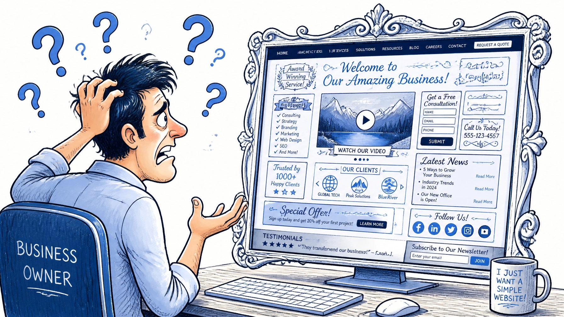

You paid for a beautiful site but it does not sell You have the traffic but no one is buying The phone is not ringing and the inbox is empty This is a common problem for many businesses in 2026 A pretty design is not the same as a functional one Custom website design must focus on results first We see many companies make the same mistakes They focus on how the site looks rather than how it works You need a site that guides the user to a goal We have found the top reasons why sites fail to convert We also have the solutions to fix them today Follow this guide to turn your site into a lead machine
1. Your Site Loads Like a Snail
Speed is the most important factor for user experience If a page takes more than three seconds to load people leave They do not wait for your beautiful images to appear Slow speed kills your search engine optimization ranking too Google knows when users bounce back to the search results This signals that your site is not helpful You might have high-resolution images that are too heavy You might have too many scripts running in the background Every extra second costs you money in lost leads

How to fix it
Compress every image before you upload it Use a tool like TinyPNG to shrink the file size Remove any plugins or widgets you do not use Use a content delivery network to serve files faster Test your speed on Google PageSpeed Insights regularly Keep your technical foundation clean and light Speed should be your first priority for conversion
2. Mobile Users Are Having a Hard Time
Most of your traffic probably comes from phones now If your custom design looks bad on mobile you lose half your leads Small text is hard to read on a tiny screen Buttons that are too close together cause accidental clicks This is called "fat finger" syndrome and it is frustrating A site that is not responsive feels old and untrustworthy You need a custom website design that works on every device Check your site on an iPhone and an Android today See if you can navigate the menu with one thumb

How to fix it
Use a mobile-first design approach for new pages Ensure buttons are at least 44 pixels wide and tall Increase line spacing so text is easy to scan Hide unnecessary decorative elements on mobile views Make sure your phone number is a "click to call" link Test your forms on a mobile device frequently Make the mobile experience seamless and fast
3. The Navigation is a Maze
Visitors arrive with a specific question in mind They want to find found information quickly If they have to hunt for your services they will quit Some designers try to be too clever with menu labels Using words like "Our Journey" instead of "About Us" is confusing Navigation should be boring and predictable You want users to think about your offer not your menu A cluttered header makes people feel overwhelmed Keep the choices simple and direct

How to fix it
Limit your main menu to five or six items Use standard names for your pages like "Services" or "Pricing" Put your most important link on the far right of the menu Include a search bar if you have a lot of content Use a "sticky" header so the menu is always visible Make sure the logo always links back to the homepage Guide the visitor's path with clear labels
4. No One Knows What You Actually Do
You have five seconds to explain your value proposition If a visitor cannot tell what you sell they leave Vague headlines like "Innovation for the Future" mean nothing You must state the problem you solve and the result you provide People want to know how you make their life better Your hero section should be a billboard for your brand Avoid industry jargon that confuses the average person Be clear rather than clever every single time Clarity is the key to conversion rate optimization
How to fix it
Write a headline that includes your main keyword Add a sub-headline that explains who you help Show a picture of the positive outcome you provide Use a bold primary call to action button right at the top Make sure the text is high contrast and easy to read Ask a friend to look at your site for five seconds If they cannot explain your business you need to rewrite it Keep the message simple and direct
5. Your Calls to Action are Hiding
A call to action is a command to the user "Click Here" is a weak and boring command "Get Your Free Quote" is a strong and clear command You need buttons that stand out from the background If your buttons are the same color as the rest of the site they disappear Do not be afraid of high-contrast colors like bright blue or orange Repeat your main offer several times on the page Users often need to see the button three or four times before clicking Make it impossible to miss the next step
How to fix it
Use one primary color for all your action buttons Put a button in the top right corner of every page Place a button at the bottom of every service description Use action-oriented verbs like "Start," "Join," or "Buy" Avoid using too many different offers on one page Focus on one goal for each specific landing page The button should be the most visible thing on the screen
6. You Are Attracting the Wrong People
Sometimes the design is fine but the traffic is bad If you rank for keywords that do not lead to sales you fail This is a common issue with poor search engine optimization You might be getting traffic from people looking for free info These people are not ready to hire a professional agency You need to target high-intent keywords that signal a need Look for phrases like "hire a web designer" or "IT support services" Quality traffic is always better than high volume traffic Check your search console to see what terms people use to find you
How to fix it
Update your keyword strategy to focus on buyer intent Create specific landing pages for different services Use negative keywords in your ad campaigns to block junk traffic Analyze which pages have the highest bounce rate Tailor your content to speak to your ideal customer profile Focus on solving specific problems for your niche Align your marketing with your business goals
7. There is a Serious Lack of Trust
People are skeptical of companies they find found online They need proof that you are real and reliable If you have no testimonials or reviews you look risky Case studies are the best way to show you can deliver results Display the logos of companies you have worked with in the past Include professional certifications and awards you have won Trust signals reduce the fear of making a bad choice A site without proof is just a collection of empty promises

How to fix it
Add a dedicated "Testimonials" section to your homepage Include real names and photos with every quote Write short case studies that show a before and after Show your face and your team in an "About" section Include your physical address and phone number clearly Add a "Verified" or "Secure" badge if you take payments Let your happy customers do the selling for you
8. Your Forms are Too Long
Every extra field in a form reduces your conversion rate Do you really need their fax number and home address right now Ask for only the most essential information to start a conversation A name and an email address are usually enough Long forms feel like homework for the visitor They will often abandon the process if it looks too hard Make the "Submit" button big and easy to tap Confirm that you received their message immediately Tell them exactly when they can expect a response
How to fix it
Cut your contact form down to four fields or less Use multi-step forms if you absolutely need more data Ensure the form works perfectly on mobile devices Add a clear privacy statement near the submit button Use "smart" fields that auto-fill common information Provide an alternative way to contact you like a phone number Make the barrier to entry as low as possible
9. Visual Clutter is Distracting Everyone
Too many animations and pop-ups drive people away If everything is flashing nothing is getting noticed White space is your best friend in web design It allows the user's eyes to rest and focus on the important parts A cluttered site looks unprofessional and messy It creates decision fatigue where the user gives up The best custom websites are clean and organized Every element should have a purpose or it should be removed Focus on a few high-quality images rather than twenty small ones
How to fix it
Increase the padding and margins around your text Remove any auto-playing videos or music Limit the number of fonts and colors you use Use bullet points to break up large blocks of text Keep your paragraphs short and easy to scan Check your site for "visual noise" that adds no value Simplify the layout to highlight your main offer
10. You Are Not Tracking Anything
You cannot fix what you do not measure If you do not have analytics installed you are flying blind You need to know where people click and where they leave Tools like Google Analytics show you the data you need Heatmaps show you exactly how far people scroll down Without data you are just guessing about your design Small changes based on data can lead to huge wins Testing is the only way to truly master conversion rate optimization
How to fix it
Install Google Analytics 4 on every page today Set up "Goals" to track form submissions and clicks Use a tool like Hotjar to see recordings of user sessions Review your data once a week to look for patterns Run A/B tests on your headlines and button colors Make decisions based on facts rather than opinions Keep iterating until your conversion rate improves
Final Thoughts on Your Custom Website
Your website is your hardest working salesperson It should be working for you twenty-four hours a day If it is not generating leads it is not doing its job Most issues come down to speed and clarity Stop focusing on artistic flair and start focusing on the user A functional site is a profitable site If you need help auditing your current design we are here to help We specialize in creating web sites that work Contact us today to start your digital transformation